Friday 26 November 2010

Semiotics...

'Idiot' ... Ollie Moore in cop helmet at riot

MORE violence will erupt as students step up their fight against tuition fees, London's top cop warned yesterday.
Met Police Commissioner Sir Paul Stephenson said his officers were ready to get tough with students.
He admitted the Met had been caught off guard by the first protest on November 10, which ended with £1million of damage to Tory Party HQ.
He told the Metropolitan Police Authority: "We had dealt with student organisers before and we based it too much on history. Regrettably, the game has changed and we must act."
MPs will vote on the proposed rise in tuition fees before Christmas - heaping pressure on the Lib Dems.
The party's deputy leader Simon Hughes yesterday condemned protesters after they tried to storm his office in Bermondsey, South London, calling the tactic a "foolish mistake".
Meanwhile, Labour MP David Winnick described the student violence as "marvellous", claiming it gave a lead to others campaigning against cuts.
 By NEIL SYSON
A TEENAGER who gave cops "the finger" during student rioting in London should have been at a JOB interview.
Ollie Moore, 17, struck the one-digit pose wearing a police helmet and with a twisted sneer of contempt on his face.
He was photographed standing in front of a smashed-up police van amid waves of snarling protesters during clashes in Whitehall.
But far from being there to oppose tuition fee hikes, the smartly-dressed teen had gone to the capital from his parents' Surrey home to try and get his first proper employment.


Saturday 20 November 2010

Modernist Graphic Design...

What is Modernism?

Modernism was an art movement around the late 19th century to the early 20th century. It was a movement that had modern thought and disliked traditional styles of art and decorative art like Art Nouveau. Their work became more about the media used rather than what it was being used for and they   were about form following function.


 This piece of contemporary Graphic Design has some modernstic styles within it, such as the simple typography with the primary colours, it has been kept simple and to the point and its not trying to be more than what it is. Much like the rule of modernism with form following function.


The directional lines and geometric shapes on this piece of Design showed similar representations of Modernism, they began to incorporate simple shapes in their design in order to make it easily understandable.


The ways in which the typograghy has made up some of the image and the ways in which the buildings have been portrayed are similar to Paul Citreon's ' The Metropolis', which was a photo montage of buildings in the time of Modernism.

Again i chose this piece because i felt that the simplistic design and shapes were relevant to the focal points and aims of the Modernist society. Also with the red and white colour it reminded me of the Russian Revolution with Communism being represented through red and Capitalism being represented through white. The majority of this poster is red which could symbolise an overtake of Communism and Modernism. There is a timeless modern aesthetic within this piece of anti ornament.


I chose this piece of Graphic Design because of the geometric shapes and how they have been used to create a visually interesting compositon that reflects on experimentations through Modernism.

Thursday 18 November 2010

The Document

The camera never lies and taking photographs is never a neutral activity.
The two main mass observation photography groups were Magnum and FSA photographers.


Joseph Nicephore Niepce (1826), 'View from a window at La Gras'


800px-View_from_the_Window_at_Le_Gras,_Joseph_Nicéphore_Niépce.j.jpg

This photo was one of the first taken, it immediatly transcends painting with its technical mastery and its medium gains power.


James Nachtwey is a witness photographer, he was not just about documenting the world through his photography but he wanted to change the world and record history. So that future generations could see what had happened in the world, such as the Wars.

Documentary photographers involve themselves in society, they take a subjective stance and attempt to persuade others and expose their photography for a means of humanity.


5168.jpg
The purpose of his work was to show the truth about what was happening around the world to the world, his photographs could sometimes be quite shocking and emotional.


William Edward kilburn 'The Great Chartist meeting at the common' 1948


William Edward Kilburn - The Great Chartist Meeting on Kennington Common, 1848.jpg
This photo shows the Chartist meeting up, Kilburn has taken a step back as to not disturb the meeting with his photography, but he stayed close enough to document the event.


The question was then posed:

'How can photographers not influence an event, even in the slightest way?'


Roger Fenton 1855, 'Into the valley of the shadow of death'


12702w_terriblebeauty_1.jpg


Henri Cartier Bresson

cartier-bresson-decisive-moment.jpg

Henri was a documentary photographer but he also produced photos that had an aesthetic quality to them, he had the photograph in his mind before he took it.

He waited for ' The Decisive moment'.

Which posed the question:

' How much should documentary photography concern itself with aesthetics? '


Jacob Riis, was a middle class social campaigner, he released a book called ' How the other half live', which contained photographs showing lower class and middle class ways of life, which were then shown to the upper class. Which made the camera with a conscience.

'Bandits Roost' 1888

roost.gif


This photograph was not a neutral photo, the people are posing and presenting a sense of themselves, Riis has created this fantasy depiction of how he thinks they live.

'Growler gang in session' 1887 (robbing a lush)


Again this photo by Riis shows a fake portrayal of lower class people robbing an upper class, but really Riis has bribed kids to act out a robbery so that Riis could take photo portraying these kids as ferrel, but if you look closely you'll see that they are all actually wearing the same clothing.


Othering is a way of defining and securing your own positive identity through the stigmatization of an 'other'.

The FSA which ran from 1935 till 1944 was directed by Roy Stryker, which raised from the Great Depression. Photography was used as both photojournalism and an emotive lobbying tool.

When there was mass social crisis the FSA documented, they were given a script to follow in terms of what they had to photograph also known as a 'shooting script'.

Margaret Bourke-White - Sharecroppers Home, 1937.jpg

This photograph was taken by Margarat Barker in 1937, the 'Sharecroppers home' was a depiction of a young black boy and his dog. The photo is quite sentimental and empathetic. The young boy is surrounded by piece of advertising from newspapers yet he himself could never afford such luxuries.


Russell Lee - Interior of a Black Farmers House, 1939.jpg

Russell Lee's 'Interior of a black farmers house' 1939 had a more open meaning to it, and was trying to disguise itself as a neutral photograph.


Dorothea Lange 1936 'Migrant mother'


dorothea_lange_florence_thompson.jpg

This was taken during the time of the great depression, it shows a mother and her two children living in a shack. The expression of the woman has been set pre shot as to make the audience feel sorrow for the woman and her children.

dorothea-lange-3_jpg2.jpg

The formation of the scene was then changed to just the woman feeding her baby, Lange tried out different compositions until she was happy with one that depicted their emotion and lifestyle. All of the negatives taken were sent to the government, so they could see the good and the bad photos, as they were negatives they couldn't be deleted.


Walker Evans

walker_evans_10.jpg

evans_burroughs_fc.jpeg

These two photographs were taken by Walker Evans they are documenting the life of a lower class farmer, the top one shows the man with puppy dog eyes and looking very sympathetic, this photo was made to attract an audience through feeling sorry for the man. The second photo the man has more of a stand off stance as if to say look what you upper class people are doing to me, it almost has an angry ambience to it.


evans_graveyard_houses_steel_mill.jpg

 This is another photograph by Walker Evans called ' Graveyard, houses and steel mill' in Bethlehem, Pennsylvania 1935. There some very iconic images of everyday life, its a very aestheticised photograph, and a reminder of our own mortality. The houses represent us living, the factory showing we work and the graveyard showing we die.


John Lamprey 1868 ' Front and profile views of a malayan man' 

fig02-01.jpg

This photograph compares and contrasts with us, 'othering'. It tries to disguise itself as being a scientific pursuit.


capa_beach.jpg

Robert Capa, Normandy France 1945. This photo shows the British Army approaching the shores of Normandy during the war, Capa played an important role, he and other photographers who documented war and conflict produced horrifying but striking human experience. In this particular photograph the image is quite blurred, people are not sure if this effect was accidental or purposely done but it became known as the 'Capa Shudder'.

Some people forget when they see photographs like these that the photographer themselves would of had to be there to document the war, which means they were putting their lives at risk in order to document history for future generations.


Robert Haeberle 1969 Mylai massacre Vietnam

70.jpg

The image above is quite disturbing when you are told what is happening.

The family are seconds from being shot, the pure raw emotion on their faces is real. Harberle intercepted American soldiers seconds before they executed them so he could take a photo, once he had taken one they were shot dead. He could not look but from the corner of his eye he saw them fall to the ground.

It is an image of immense power and shows the last image of their lives which will be reserved forever showing just how inhumane we as people can be.

It brings up the question whether or not it was right what Haeberle did, should he have saved their lives after intercepting their fate or should he have stayed away. We know his intentions of the image, but was it morally right?


Thursday 11 November 2010

Graphic design: A medium for the masses...

Over a million years ago cavemen began to paint pictures of horses and bisons and the world that they saw around them. This was an early technique of visual communication.

- A fine art painting by Giotto represented the scene from the Bible when Jesus was taken to be crucified. Particular religious symbols and imagery were used to visually communicate the story if it was not that easy to understand. Such as the deciples and Jesus have halo's around their heads, the story was set out in a comic strip style to easily illustrate the story.

- Pear soap advertising, the image was initially a painting but when text was added it was unsure whether it was a piece of Graphic Design or Advertising.

Work of William Addison Dwiggins.


- Graphic Design then truly emerges from the work of Edouard Manet


- And also the Art Deco and Art Nouveau movement

Alphonse Mucha


Peter Behrens German electricity advert is a piece of work that became part of Graphic Design. The layout, imagery and typeface has all been kept simple and used in an effective way.


Savile Lumley's poster is a very traditional and conservative piece of Graphic Design.


The poster above is work of Jukius Gipkens, his work became less fine arty and more Graphic Design based.

Wassily Kandinsky is another fine artist whose work was quite abstracted, he later went on to work at the Bauhaus.


This is a political poster designed by El Lissitsky, his work was very geometric. This particular poster was designed during the Russian revolution.


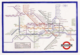
This is the early design of the London underground by F H Stingemore. His design is very geographical and shows the representation of distance.


Harry Becks tube map was more a piece of design rather then actually representing true distance. He used colours so that international people could also read them easily.


Simon Patterson then turned the tube map into a piece of fine art, he replaced the names of tube stops with names of famous people, it was witty commentary.


Oskar Schlemmer designed the Bauhaus logo, he set a president for what happens in post war design.


This poster was designed by Herbert Bayer to celebrate Kandinsky's 60th birthday. The use of angular design started to emerge to try out different visuals and layouts.


These posters were designed by Herbert Matter, at this time they were pieces of very cutting edge design and he was well known for his Graphic Design. These posters have recently been used in the Swatch watch adverts.


Hans Schleger's poster above was trying to promote healthy eating, it is a very figurative design and quite conservative.


Poster by Pere Catala is visually communicating a message, no text is needed as the imagery used speaks for itself.


This poster by Abram Games was designed for the celebration of victory against facism, the war was over and there was a celebration of what it means to be British. Abram was the most influencial and cutting edge designer of this time.

Paul Rand had a very commercial nature to Graphic Design, in 1946 he was a key Graphic Designer of his time, he promoted the economic boom. His work was well known for commercialism, branding, corporate and capitalism.


Above the sainburys classic cola can and the coca cola can. People began to buy the sainburys version thinking it was the coca cola original because of the design, so it goes to show that a companys image and design can be so well known that people dont even look twice before buying it.

Ken Garland published the 'First things First Manifesto 1964'

First things First Manifesto


Peter Saville was famous for the Blue Monday, new order. Which was the best 12inch single ever made. Because of its eleborate design it was costly to produce and ended the company in debt. His work was post-modernism. In this design he devised his own typeface through the representation of colour but know one could understand it.

- Neville Brody was a key post-modernism designer who designed the covers of Compose magazine.

- David Carson saw the rise of the grunge movement, he re-wrote the rules of Graphic Design... Graphic Design for Graphic Design sake. He questioned if communication and legibility were the same thing.

Peter Blake was a pop artist during the Band Aid movement.


There was a backlash from the poster by Peter Blake by the political anarchists, Chumbawamba. People questioned whether this was good or bad Graphic Design or was it invented in forms of message.


The first image above is a record cover for the Coups, it was designed before the terrible attack on the twin towers, 9/11. The image was withdrawn for obvious reasons.


Jonathon Barnbrooke created his own symbolised typeface on what he thought of the olympics, raising awareness of the true story behind the event.

Oliviero united colours of Beniton adverts.


Sunday 7 November 2010

Modernity and Modernism: An introduction...

Modernity is the process in which the world started to become 'modern' with significant changes that took place broadly between 1750-1950. It was to enhance the social and cultural experience.

Modernism is the term used to describe the cultural expressions of modernity in relation to the experience of modernity, (much like a design movement or art movement like Cubism, Impressionsism and Surrealism etc).

- without modernism you wouldnt have contemporary design. Up until the 18th century the word 'Modern' in culture was used for direct comparison. The Modern's were superior to the 'classical's'.

- Modern was a progressesion to improve, much like The New Labour party, it was to signify better things.

- Modernism lasted for about 200 years, and there was a rapid change, Paris was the most modern city in 1900.

Modernism cam from the shift in society also known as Urbanisation. Which is when places were no longer rural but became more urban. The city was the most common residence as there were new forms of leisure such as galleries, cinemas and shopping.

Also before Modernity there was a world standardised time, which meant the world ran on the same time, whereas now we have GMT and other countries around the world differ in times.

When Modernity came around it began to move away from religion and spirituality and looked more towards the idea of science in the late 18th century. Society was now secular and the city became the personification of Modernity.

Paris began to become modern yet still kept some of its historical elements.

- Modernity began to shift the ways in which artists responded to the world, the experience of Modernity bacame the man subject within their work.

Work by Caillebotte was focusing on the new living in Modernity and thelifestyle rather then the people themselves.

The Haussmanisation was an era when the re-design of Paris was to begin to accommadate the speed of new Modernity. Paris was a socially desirable city and it was cleansed for Modernity.

Portraits by artists showed the alienation through Modernity and it's experience.

Physchology then emerges in 1893, with the technological wonders and when people started to worry about the speed of ageing. Modernism speeded up our lives but also made us more distracted. It condenced social spaces also making poeple more competative and had them making direct attemts to make themselves look better by engaging with the new technologies and the new way of living.

It invented things like the Kaiserpanorama in 1883, which was a round viewing device that people could put money into and watch slides of erotica, art and pictures of the modern world. They ahd began to prefer to watch the world through new technologies rather than in a direct way.

Soon after cinema was invented and the first film by the Lumiere Brothers was shown. The film of a train coming into a station scared people in the first showing because they thought it was real life. People also started to see the world from a birds eye view which they found fascinating.

The Lumiere Brothers first film

- Monet's work reflected on the sensations of Modernity, and the Impressionists began to be influeneced by photography.

- The Flat Iron building in New York is a product of modernity, towering over nature, it is a rational piece of design.


Paul Citreon- Metropolis 1923, is a photo montage, showing the experience of Modernity in a condensed way.


Edward Muybridge created images where he was trying to understand ourselves in a scientific way.


There was then the stages of Anti-Historicism, which was about not looking backwards but fowards, and the idea in modern design with a principle to let modern materials speak for themselves. If a chair is metal then dont try and disguise it as wood etc.

There was the whole idea of truth to materials and form follow functions within design and the form of modern function should fit it's purpose.

- Internationalism was another part of modernity, where all modernists designs should be readable and understandable by anyone anywhere. It created a democratic international language.

In regards to truth to materials and that form follows function, pre 19th century cutlery was attempting to disguise materials, it had aspirations to be artistic, whereas Bauhaus cutlery followed the truth to material and that beauty comes from simplicity.

Adolf Loos in 1908, once said that the desire to decorate is the sign of the retarded delivery and backwardness... ornament is crime. He was also against tattoos as he didnt see the point in decorating ones self when the body is beautiful as it is.

Bauhaus was the most influential art school of the 19th century and was the main start and influence of Modernism, it taught and lived Modernism. It was an interdisciplinery school for modernist practitioners, modernising education.
The school was shut down by the Nazi's as they thought it was developing too quickly.

- The Bauhaus created designs that could be mass produced and available to all.

Harry Beck designed the London underground maps, he made them colour coded so that they could be read by anyone, he had an international ethos, fitting in with the idea of Internationalism.


In the same era as Modernism there began the developing of historical fonts again from the classical culture. The Times New Roman font was designed in 1932. Along with the Nazi's Fraktur font to show historical roots.