Sunday, 6 March 2011

Graphic design and desconstruction...

What is deconstruction?

Deconstruction arrose from Post- modernism and Post- structuralism, it was something that became visually interpreted in Graphic design. Deconstruction was not a style as such, it was more of an approach about questionning the hidden assumptions in life, unpicking hidden structures.

500 word analysis on Lupton, E (2008) 'Thinking with type'

Lupton talks about type in a very different way compared to contemporary theorists. The first points that he makes about type in his writing 'Thinking with type' is that text is not just there to be read, ' it can be viewed as a thing- a sound and sturdy object- or a fluid poured into the containers of a page or screen. Text can be solid or liquid, body or blood.' The point he makes about text not just being text is very important in contemporary design, when a designer sets about formatting a piece of text they need to do it in a way that makes it different from others and interesting, the layout and design of the text should reflect on its content. It should make the reader feel something and it should make them think about the text 'design' and not just the content they are 'reading'.

Next he talks about the way in which designers layout text on a page and how it can be indented and broken up so that the reader can find ways to read the parts that they need to rather than reading the whole text of which half may not be relevant to their readings. The designers job is to make reading an easier and quicker process, Lupton says ' although many books define the purpose of typography as enhancing the readability of the written word, one of design's most humane function is, in actuality, to help readers avoid reading'. The techniques that are used to make readers reading experience easier actually diverts them from reading hardly anything at all.

Errors and ownership became very important around the 1960's. When handwritten documents were reproduced, before printing was invented, they were riddled with errors. The copies were copied from copies so each reproduced piece had its own glitches or gaps. After the invention of new ways of printing, proof copies were proof read before a mass was reproduced, so thay any mistakes could be justified and corrected. But again as technology evolved, text became downloadable from online and users could then reformatt the text.

 In an essay 'From work to text' written by French critic Roland Barthes, he talks about linearity ( meaning the property, quality or state of being linear) and the two opposing models of writing: ' the closed, fixed "work" versus the open, unstable "text". The work was a tidy, neatly packaged object, all proof read and perfect where as the text was the complete opposite, it was impossible to contain. The text was something that was very different, it could be a jumble of references, recieved ideas, echoes and cultural languages.He then goes on to talk about the attack on linearity, new devices that were being used in writing were providing means of escape and entrance from the one way stream of discourse. Meaning that writing occupies space as well as time and typography's most urgent tasks was to now liberate readers from the bonds of linearity.

He then goes on to talk about the importance of the author within a piece of text. When a reader reads a piece of text, whose voice is in their head whilst reading, is it their own, the author's or the voice of a character in the text. And if it is their own voice then do they still interpret the piece of wrting as it was meant to be interpreted by the author, or does it change by the way the reader reads or sees words. Is it now the death of the author, do they simply write and then all the power falls into how it is displayed by typography and how the reader interprets.

Katherine McCoy, a designer talks about how typography is not only read but also seen and much like images and pictures, they can be read like text, the way in which we read and see things is changing all the tie and this is through the evolution and change within type design and layout, it is a constant battle of what is more important, the text or what they mean.

Examples of Deconstruction in Graphic Design:


David Carson is a well known Graphic Designer who uses deconstructive techniques in some of his work, a prime example is his designs for Ray Gun magazine. The way he used typography went against traditional graphic design 'rules', there is no form of layout or grid, everything seems as though it had just been thrown on a page. Type overlaps and becomes illegible, again going against the purposes of good graphic design.


David Carson, Ray Gun magazine 


David Carson, Ray Gun magazine

Essay bibliography using Harvard referencing...

What is Harvard referencing?

When writing an essay or distertation it is important to know how to correctly reference your information sources throughout your written work and within your bibliography. The system used is called The Harvard referencing system.

When referencing you must try and include the following information:

- The author or editors name
- The year the book was published
- The title of the book
- If it is an edition other than the first
- The city the book was published in
- The name of the publisher

With journals you will need:

- The authors name (s)
- The year the journal was published
- The title of the article
- The title of the journal
- The page number of the article/ journal
- As much information as you can about the journal like the volume and issue numbers

For electronic sources:

- The date you assessed the source
- The electronic address or email
- The type of electronic source (email, discussion forum, WWW page etc)

My essay bibliography using Harvard referencing:

- Packard, V (1957) 'The Hidden Persuaders', IG publishing, Reisse Ed
- Berger, J; www.thinking-about-art.blogspot.com/2008/06/john-berger-ways-of-seeing.html, website
- Berger, J (1972) ' Ways of seeing', British Broadcasting corporation
- Reeves, R (1961) 'Reality in advertising', Minnesota, Knopf
- Reeves, R (2011), .www.wikipedia.org
- Bernbach, W (1950-1970), http://www.brainyquote.com/quotes/authors/w/william_bernbach.html
- United Colours of Benetton (1989) Campaign for black and white equality, Oliviero Toscani

Sunday, 27 February 2011

Post modern graphic design...


Terry Jones,i.d young British culture magazine, published 1980, found on wordpress.com.

This is a piece of Postmodern graphic design because of the way in which it fights against the strict constraints of design, it has been designed using an aggressive collaged style in order to be young and cultured and appeal to its target audience, its much about rebellion.


Sex pistols music poster, released in 1977.

This music poster is postmodern again because of the way it rebells againsts the traditional techniques of graphic design and poster design, its design was seen as so rebellious that the actual song was band after people thought the poster was personally attacking the Queen, when in actual fact it was meant to be portraying old Britain.


Barbara Kruger, 1981.

This piece is very unconventional, it goes against the rules of typography. It has been designed in a way that is very untraditional to what we know, the layout and the way that the text has been organised like a ransom note is very unconventional.


Reid, J (1977) 'Album cover'
 http://gds.parkland.edu/gds/!lectures/history/1975/postmodern.html


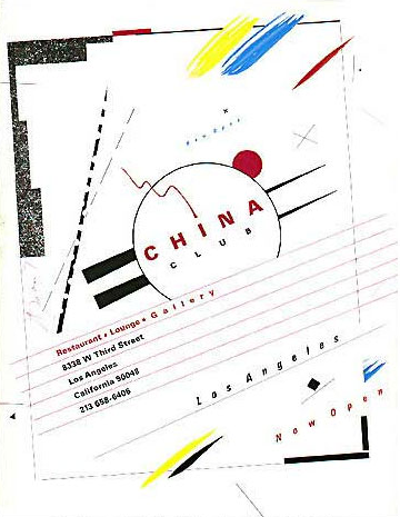
Greiman, A (USA 1980) Nightclub/ Advertisement 
http://gds.parkland.edu/gds/!lectures/history/1975/postmodern.html

This example of post modernism uses traits from other artists work rather than designing from scratch. It uses a similar style to Weingart and even Kandinsky.


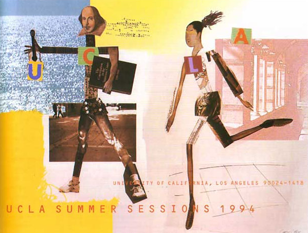
Coy, J (USA 1994) poster
http://gds.parkland.edu/gds/!lectures/history/1975/postmodern.html

The use of collage in this poster, using well recognised faces makes it more appealing and it also makes it witty, which was part of the post modern design. The use of collage was also a new way of working, unlike traditional methods such as painting.


Monday, 7 February 2011

Avant Garde...

Avant Garde was an Art and design style that's purpose was to be progressive and inovative. Avant garde was quirky and original, in a way it mocked the elitism of art and challenged the conventional assumptions of what art is. It was very anti- conventional and anti- elitis.

Now a days the term avant garde has been dispositioned and it is slightly weird in what people call avant garde today.

To be avant garde one must be ahead of society and outside of it, to be able to become a creative genius and inovative.

Avant Garde is a French military term meaning cutting edge/ political and aesthetic.

I have found two pieces of Avant Garde Graphic design:


The two images are proposed pieces of avant garde graphic design, they aim to be inovative and striking. Both images are from the Adbusters website. The top image shows a woman breast feeding a branded baby. Adbusters purpose is to be very anti- consumerist and the ad above is doing this in a very avant garde way. They have branded the baby to show that it has already been pumped with consumerism. Its a spoof ad that is trying to be progressive by going against society and representing their ad in a controversial way.

The second as is also by Adbusters, it shows a rather large man's stomach, its pretty much saying that to be free means to be fat. The man had the freedom of food and by that he has consumed too much and became grosly obese. Again they use a very striking technique to get their point across. They have tryed to challenge the way in which consumerist advertisment is protrayed. Their work is more grounded, aggressive and real. It is showing it as it is, not in an elitis way. I think this is why avant garde is so important when done in the right way.

It is to be real and not show fantacies, to be out there and to be almost better than the world but in an anti- elitis way. As a society we have always known art to be for the rich and fortunate. Avant garde allows the lower classes to enjoy art too.

Monday, 24 January 2011

Essay...


‘Advertising doesn’t sell things; all advertising does is change the way people think or feel’

Jeremy Bullmore

Evaluate this statement with reference to selected critical theories (past and present).

This statement can be quite controversial, but in a way true. When adverts are produced their aim is to sell a product to its target consumer, they seem to promote a way of life, which their product can provide or create. Sometimes manipulating the consumer into buying something that maybe they hadn’t thought about or intended to purchase. But they make you feel that actually they do need this product to full fill their lives. Advertising promises another, better way of living.

Persuasion in advertising can be cunning and clever; they play on our thoughts and feelings. They create a need for a person and the persuasion appeals to the persons need for love and self-esteem. They will also try to appeal to the social needs of a person, to be popular and respected by having their product. Television plays on this a lot, as it is widely accessible to almost everyone.

Opinions on advertising and the way it affects consumers are very diverse and somewhat arguable.
John Berger, an English art critic created a series of TV programmes looking at different types of art, he also wrote a book ‘Ways of seeing’, he talks about the effect art can have on our lives and in one instance he focuses on advertising, he says

‘...publicity as a system only makes a single proposal. It proposes to each of us that we transform ourselves, or our lives, by buying something more...publicity persuades us of such a transformation by showing us people who have apparently been transformed and are, as a result, enviable...’

Quote taken from ‘Ways of seeing’ by John Berger.

(Enviable meaning: worthy of envy; very desirable).

Berger in a way agrees with the above statement, he has said that publicity (advertising) is only a system to make us feel that a product can help us to be a better person and to live a better life. But of course it has the intention of selling things because people believe that they need the product.

‘Advertising is not merely an assembly of competing messages; it is a language itself which is always being used to make the same general proposal...’

Another quote from Berger continues his theory and belief of advertising techniques, it has one purpose and one purpose only, to propose better well being.

Another theorist of advertising is William Bernbach, Bernbach says

‘Advertising doesn’t create a product advantage. It can only convey it...’

He is proposing that advertising does not try to trick consumers into buying a product which will change their way of living, it merely shows how it could if used in the correct way and with the correct person, it gives a bit more freedom to the consumer, to be able to make the decision for themselves in whether or not this product could or in fact will change their life as it were.

He quotes

‘The most powerful element of advertising is the truth...you can say the right thing about a product and nobody will listen. You’ve got to say it in such a way that people will feel it in their gut. Because if they don’t feel it, nothing will happen...’

In other words, if a brand wants to publicise a product they should do it in a truthful and honest way, show how this product could positively affect someone’s well-being or lifestyle, they need to have trust in the brand in order for them to make a purchase. Trust is the key to good sales.
Rosser Reeves was a successful American advertising executive and TV advertising pioneer, he focused on one key technique when creating his advertisement, ‘The unique selling proposition’. The unique selling proposition is the one sole reason that a product needed to be bought by consumers or how it was better than its competitors.

Reeves quotes

‘ Successful advertising for a flawed product would only increase the number of people who tried the product and became dissatisfied with it...i believe it is a waste of money to claim uniqueness that doesn’t exist, because consumers will soon find out, they won’t come back to the brand...money would be better spent building some kind of meaningful advantage to the product before launching a costly advertising campaign to promote it...’

Quote and above information founded on Wikipedia.

Reeves, much like Bernbach, believe in truthful advertising, why lie to the consumer when you don’t actually need to. So in relation to the statement of advertising, it appears that Reeves’s theory may in fact disagree. The statement says ‘advertising doesn’t sell things’, but it must in order for any kind of brand to make a profit, Reeves just believes that it must be done in a way that is honest to the consumer in order to make them feel or think in a different way, it’s by choice in Reeves’s eyes rather than brainwashing a consumer.

Vance Packard and his book ‘The Hidden persuaders’ was first published in 1957, it was about media manipulation in the 50’s and it sold more than a million copies.

It reveals ways in which advertisers use tactical techniques to manipulate the expectations of the consumer and inducing desire for their product. He also identified eight ‘compelling needs’ that advertisers promised their product would full fill. He focused on the way in which advertisers could change the way in which people did think or feel through product publicity, he explores how these worked and if they worked. He looked into consumer motivational research, psychological techniques and subliminal tactics. He seems to have an undecided opinion in relation to the statement, he mainly focused on tactics and techniques and the effects these have on consumers, rather than saying yes advertising does change the way we think or feel; or no advertising does sell things and these techniques often aid in doing that, they are not solely to brainwash our thoughts.

An example of advertising that does change the way we think and feel, is the campaigns bought out by The United colours of Benetton. The purpose of their campaigns is to captivate us and in some cases shock us. They aim to produce striking campaign images that will make us stop, look and think and if successful feel different. An example of an older campaign is that of a black woman breastfeeding a white baby. The campaign, directed by Oliviero Toscani;  was released in 1989, it was to campaign for black and white equality and it caused a strong reaction in the black community.


Now although Benetton is renowned for selling clothing, which it does using advertising, it has these campaigns to induce a reaction and feeling, so in relation to the statement Benetton has two ways of publicity for their brand, one to sell things and one to change the way the consumer thinks or feels.
Apple is another example of strong advertising, Apple’s goal is to make the consumer believe that if they buy one of their products they will have a higher status in society and they will become a better person living a better life. Apple is known brand for being expensive and sophisticated. They are a brand that is constantly evolving, which is where they make their profit, if a consumer buys an Apple product they are ‘cool’ as it were, and everyone always wants the newest piece of technology, so by generating newer and better products within shorter spaces of time than some brands, Apple can convince its consumers to update more often, you can see one type of Apple product, for example the ipod, evolve several times in the space of a year.

We could be presented as consumers with an mp3 player and an ipod, both having the same qualities and specifications, the ipod costing the most, and in most cases we would choose to purchase the ipod because we know the brand and we trust the brand. People trust Apple, which is why they are more willing to part with their money, to own an Apple branded product.

In conclusion to the statement ‘Advertising doesn’t sell things; all advertising does is change the way people think or feel’, i think that advertising can be used in many ways to sell a product, some ways are honest and some lull us into false values of a product in order to sell an item and in many cases we fall for this. Advertisers are clever and know how to manipulate us. I can’t say whether i agree with Bullmore’s statement, advertising must sell things or it would be pointless and a waste of money to publicise a product in the first place, it’s just depends on the way in which some advertisers do this on whether or not we think or feel in a different way as consumers.

Bibliography

-        Published in 1957, Vance Packard’s, The Hidden persuaders, book details and blurb founded on www.thesocialcontract.com
-        Rosser Reeves, Wikipedia
-        William Bernbech, Wikipedia, quotes founded on www.brainyquote.com
-        United colour of Benetton, www.press.benettongroup.com

Kirsty Hardingham

Thursday, 9 December 2010

Postmodernism...


Le Carbusier, Villa Savoye, Poissy, 1928-9

-  This building had functionality and neutrality, no individuality.

Modernism practise =

- Originality
- Innovation
- Individualism
- Progress
- Purity
- Experimentation
- Seriousness 


Postmodernism condition characterised by:

- Exhaustion
- Pluralism
- Pessimism
- Dillusionment with the idea of absolute knowledge


But some overlap
Modernism and Postmodernism related

Modernism:

- Expression of:

Modern life/ technology/ new materials/ communication [Modernity]

Postmodernism:

- Reaction to:

Modern life/ technology/ new materials/ communication [Postmodernity]


Jean Tinguely 'Homage to New York' 1960

Was placed directly outside the museum of modern art, it was an anti aesthetic, postmodern gesture which had no progressive message, it was also designed to eventually self destruct although this turned out to be a failing design aspect.


Origins of Postmodernism:

Beginnings 1960s
Established as term 1970s
Recognisable style 1980s
Dominated theoretical discourse 1980s and 90s
Today: Tired and simmering

Fielder: Post culture, rejected previous culture of modernist elitist.

- Contra modernism attacks modernism.

Uses of the word "Postmodernism":

- after modernism
- the historical era following the modern
- contra modernism
- equivalent to 'late capitalism'
- artistic and stylistic eclecticism
- 'global village' (world is reduced: modern railway, telephone) Postmodernism is totally interconnected.

- According to Charles Jencks modernism dies on the 15th July 1972 at 3:32pm, the moment of the demolition Pruitt. Which was a post war building with modernist architecture. It was made as a cheap, affordable and equal building but soon turned in the ghetto slums for the under classed, it forced people with crime and was then bulldozed less than 20 years after it had been built. It was a failed piece of modernist architecture.

- Modernism got it wrong
- Postmodernism- attitude of questioning convention.

- Plan Voison 1927- Utopia and technological determinism.
- Belief new technologies will make the world better, the internet has bought us together but gives opportunities for crime.

- Postmodernism: Everyone is unique and different. New voices can be heard.
- ' I am a monument' monumentality and enforcement to be the same.

- Questioning values of modernism, forcing one dimensional vision on everyone.

- Postmodernism- only rule = no rules.

- Society starts to get confused, although all the new options are positive, kitsch.

- Park Hill flats in Sheffield built on a hill in 1960, an example of post war modernism architecture. Designed for everyone, now a slum and the people who live there raised a petition to have it demolished. But the state says its an important piece of modernist architecture.

- Urban splash designed a re-generation of Park Hill which had a Postmodern gloss.

- AT&T building- Philip Johnson NYC 1982, made modernist style more original.

- Once modernist- no longer regular, unordered.
- Mixing old and new.

- Postmodernism takes the seriousness of modernism and makes it more jokey.

- Qoute from Prince Charles about a modernist piece of architecture:
' Is somebody proposing to dive from this tower?'

Prince Charles hates modernism and postmodernism.

- Leeds magistrates court is a piece of ill thought out postmodernism architecture.

- Quilan Terry, The Maitland is Prince Charles's favourite piece of postmodern architecture.

Postmodern conditions could be summarised as a disbelief, as metanarratives (total belief system, vision of world which seeks to believe where we are going, will fail, vision of certain elitist ideoligys.

Technology and progress will save us?

- Failure of communism.
- Postmodernism undermines, exposes and reveals flaws of the way of the past.

Result = crisis in confidence.

- Modern movement- postmodern aesthetics.

- Roylitchenstein ' This must be the place' 1965
postmodern attitude in fine art.

- Pop artists point was to attack seriousness of art- sarcastic.

- High art/low art divide- one big mess.
beginning to crumble.

- Las Vegas- postmodern city?
- Playground of reinvention, we should learn from Las Vegas as its ultimately progressive.

Its all in Las Vegas, its positive to follow.

Decorated sheds- casinos and buildings.
Built individualy and developed.
Each shed reflects individuality.

- Postmodern dystopia, Las Vegas is a loss inself, failure?

- Andy Warhol- peoples identies change. It changes the status of the artist in postmodernity. It was more about the image of celebrity.

He always said he didnt understand art. He believed we are all famous for 15 minutes.

Leveling out artist and celebrity.
Formalism.

- Total rejection of art saving the world.

- Jackson Pollock- distilling all purity of painting.
He uses expression, emotion and paint.

Lampooned by Pop artists.

- Andy Warhols Oxidation painting. He peed on metallic paint until it began to rot.

- Art as communication on device as fraud.

- Piero Manzoni 'Artists shit' 1961.
This artist shat in a tin and signed it, he then sold it for thousands of pounds. People couldnt have been sure if it was in there, so they either wasted money buying fake shit or if they opened it to check and the contents was true what it said on the tin, then they would have ruined the piece of art.

- Van Gogh 'Pheasant shoes' seeks to make us feel bonded with the owner of the shoes.

- Kraftwerk: embrases new technologies, half serious half jokey.

Postmodernism:

Culture where we can reinvent ourselves continuessly.

An inconclusion:

- Postmodernism is a vague disputed term.
- Po- mo attitude of questioning.

SPACE FOR NEW VOICES.


Tuesday, 7 December 2010

New media and visual culture...

The age of print began in the 1450s, and some believe we are still living in the late age of print.

Guttenbergs printing press allowed mass communications, it became easier to print with the moveable type that was no longer fixed.

The role of the reader -  the electronic book- is it democratic?
The E book is literate, in the future all books will be electronic. Reader takes on the role of the author.

Computer media- the way we read has changed through hypertext, this allows us to surf through information quickly. Its a superficial way of reading- its a more engaging which makes it more exciting, it makes you more receptive and gives you empowerment.

Hypermedia: Hypermedia is when we see many media, pictures and sounds and we can surf through these quickly.

Definition of mass media:
Modern systems of communication and distribution supplied by relatively small groups of cultural produces, but directed towards large numbers of consumers.

Negative criticism of mass media:

- Superficial, uncritical, trivial.
- Viewing figures measures success.
- Audiences are dispersed.
- Audience is disempowered.
- Encourages the status Quo.
- Encourages empathy.
- Power held by the few motivated profit or social control (propaganda)
- Bland, escapism, seen as a drug which anaesthetises us.

Positive criticism of the mass media:

- Not all mass media is low quality.
- Social problems and injustices are discussed by the media.
- Creativity can be a feature of mass media.
- Transmission of high art material reaches a broader audience.
- Democratic potential.


United colours of Benetton
An ad created by Oliverio Toscani, Army outfit.
The ad is meant to be advertising clothes but its doing much more than that, its almost advertising politics. The outfit is that of a dead Army soldiers, dried blood can be seen and even a bullet shot through the chest. Its a reality check.


Leeds 13 was a group of students who pretended to spend all of their grant for uni on a big holiday, it caused an uproar in society as they thought it was wrong what they had spent their tax money on, even though it was all fake. These artists then gained artist status from using the mass media as their story was published in newspapers.


Can Art be autonomous? (exist on its own in a vacuum)

Should Art be autonomous? (for some yes, by doing so it retains purity and integrity)

Jackson Pollock- apitamy of Art above society, aesthetic freedom, no agenda.
Pollock funded by C.I.A?
Political propaganda- illusion of independence but involved in politics.


Roy litchenstein Whaam (1963)

Pop Art- underlining politics.


Andy Warhol, Green Coca Cola bottles 1962- 'I consume therefore i am'.


Conclusion:

- New media are changing the way we consume and read text and image.
- Theorists of the mass media have different viewpoints seeing it as either a negative and a threat or a          positive pleasurable and democratic,

- There is a serious question in Art theory as to whether Art should be autonomous or not.